Introduction
This project aims to create a website to present interactive data visualizations using U.S. official world trade data. Compared to reading the data through software like Excel, interactive data visualizations provides an easy, engaging, and understandable way for general users to comprehend the data.
Project Website: (If you cannot see the map view, please try to zoom in/out of your browser and refresh the page)
catnoodle.github.io/517/project2/index.html
catnoodle.github.io/517/project2/index.html

Idea Exploration
In this step, we tried our best to draw some sketch notes which are based on the assignment requirements and our mindset. These notes include many initial data visualization ideas and layouts, which are the basis of our final design output.


Prototype
U.S. Foreign Trade Statistics
For a user’s better understanding of our multiple view systems, we divide the whole data visualization into 2 tabs. Each of them is well labeled with a title and hover tooltip. The first tab is The U.S. Foreign Trade Statistics. Here is the overview:
For a user’s better understanding of our multiple view systems, we divide the whole data visualization into 2 tabs. Each of them is well labeled with a title and hover tooltip. The first tab is The U.S. Foreign Trade Statistics. Here is the overview:
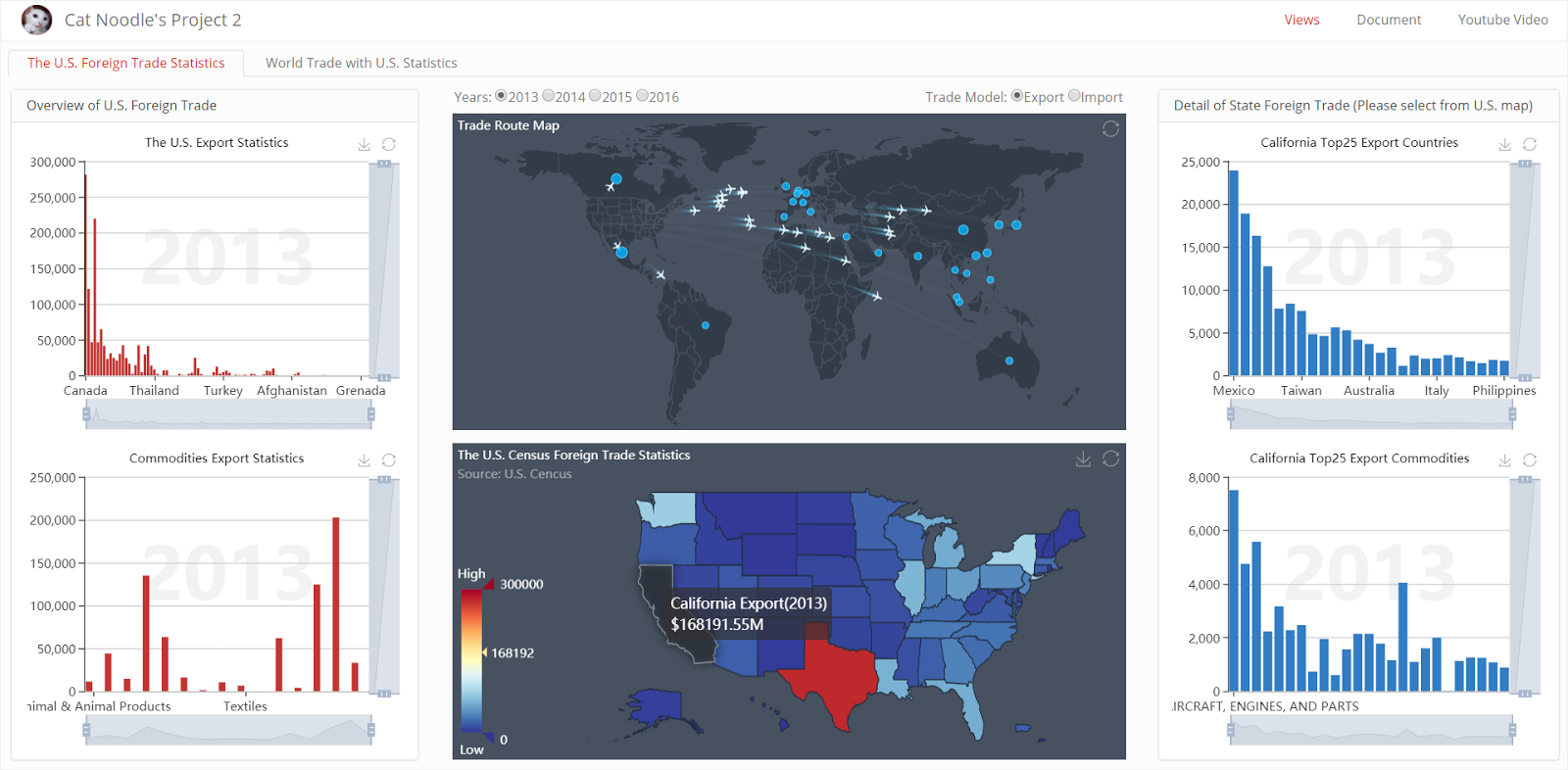
This page combines 2 primary multiple view systems. The first multiple view system is the ‘Overview of U.S. Foreign Trade’, which consists of two bar charts on the left side and the U.S. map. The bar chart of ‘The U.S. Export/Import Statistics’ shows the trade overview to foreign countries of a specific year; the U.S. map shows the overview of trade for each state; and the bar chart of ‘Commodities Export/Import Statistics’ shows the primary classification of commodities, linking with U.S. map and can be drilled into the secondary classification by clicking the bar:

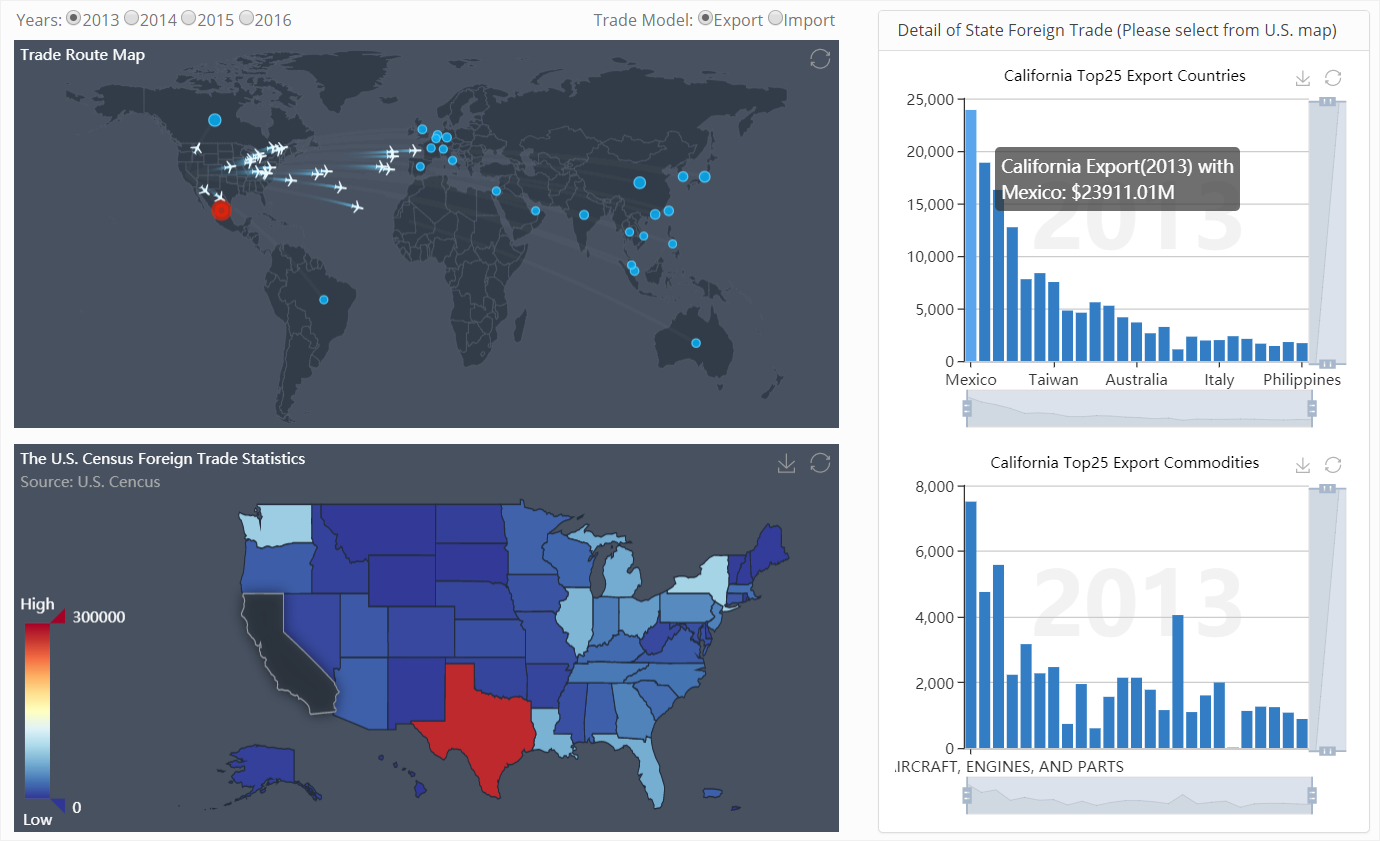
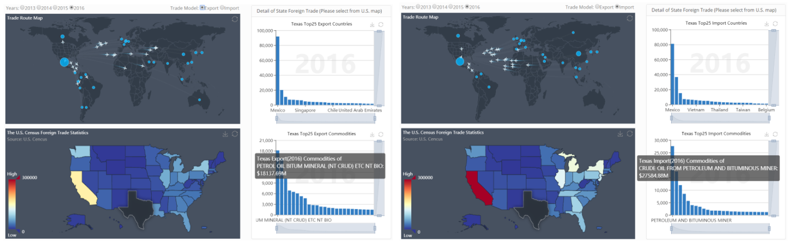
The second multiple view system is 'Detail of State Foreign Trade', which consists of 2 maps in the middle and 2 bar charts on the right. The user can click a specific state on the U.S. map, the world map will show its corresponding trade route, and the 2 charts on the right will show the data of the top 25 trade countries and commodities of this state, besides, when users move their mouse over the Top25 trade countries bars, the selected country will be highlighted on the world map:
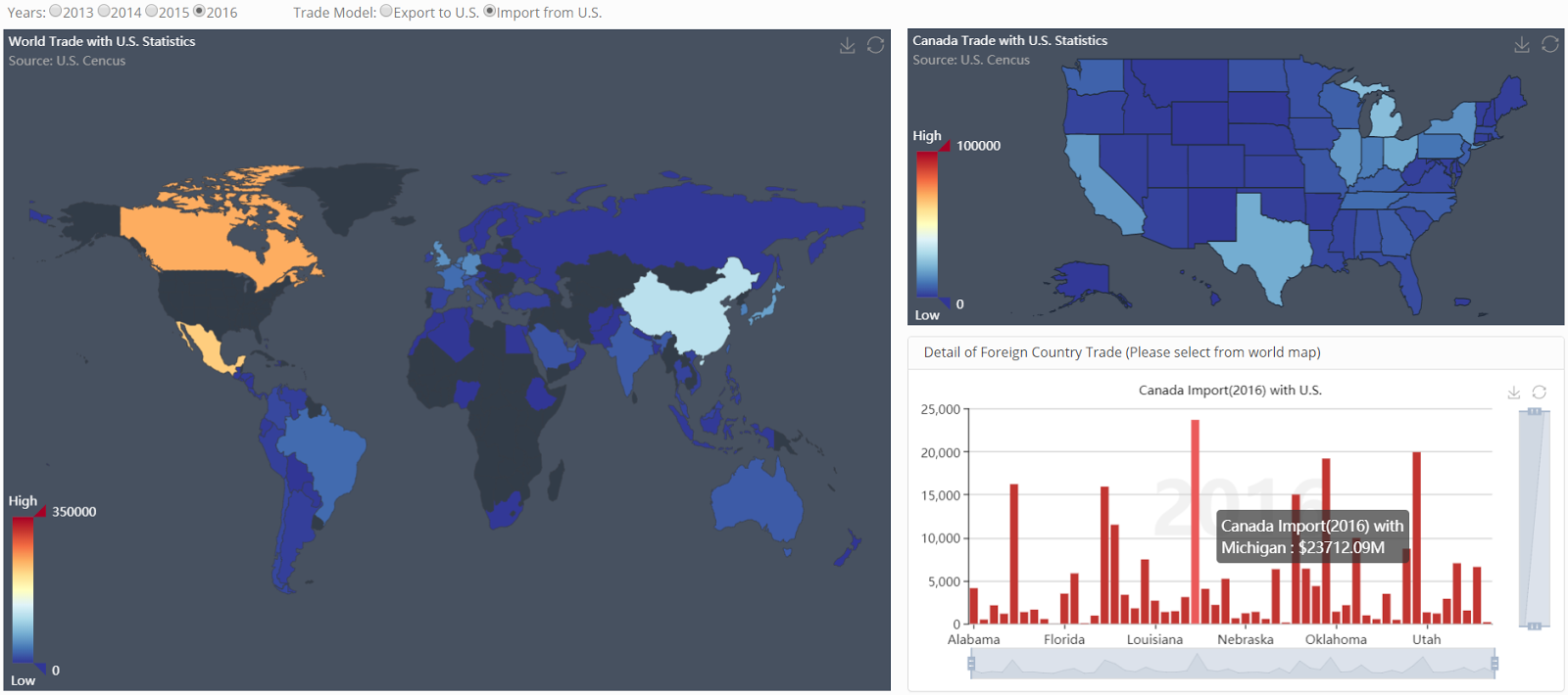
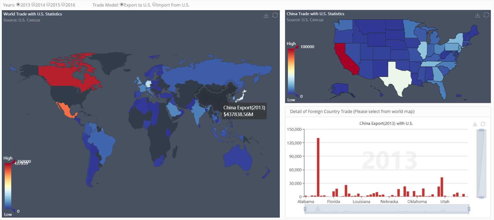
World Trade with U.S. Statistics
The second tab is World Trade with U.S. Statistics, it is a multiple view system that consists of a world map, a U.S. map, and a bar chart. The user can scan the overview of trade and click a specific country on the world map, the corresponding trade States will show on the U.S. map, and the bar chart will become a support view, to help recognize the slight difference which is not obvious on red to blue color visual map:
The second tab is World Trade with U.S. Statistics, it is a multiple view system that consists of a world map, a U.S. map, and a bar chart. The user can scan the overview of trade and click a specific country on the world map, the corresponding trade States will show on the U.S. map, and the bar chart will become a support view, to help recognize the slight difference which is not obvious on red to blue color visual map:
Design Decision
In this project, we mainly use map views and bar charts. The reason for picking the map view is that the dataset is closely related to the map, thus using the map as a part of data visualization absolutely could be an intuitive way. We also use the icon of a plane to simulate air freight. The reason for picking a bar chart is that the minimum number of each dimension is at least 25 units, using a pie chart couldn’t reach a good performance, and the timeline is controlled by the radios, so the line chart is also unavailable, treemap could be an option, but it doesn’t provide an intuitive number comparison. Therefore, we choose to use the bar chart to answer all potential questions in this project.
As for the color scheme, we use the scheme from Colorbrewer 2.0 on our visual map, mainly using 2 colors - blue and red, to reduce the user’s concept overhead. Also, we added a small tool to save the chart as a picture for future usage, the maps can be zoomed in/out by scrolling the mouse wheel on the computer or using the gestures on the touch screen devices.
Use Case
Using these multiple view systems we can dig deeper and ask some questions. For example:
Q1. Which countries are the most popular exporting/importing partners?
A. We can easily find that Canada is the most popular exporting partner from the bar chart on the first tab, which reached $245715.69 million in 2016, Mexico and China are also popular. Besides, China is the most popular importing partner, which reached $459324.96 million in 2016, Mexico beyond Canada in 2013, then fell behind in recent years.
A. We can easily find that Canada is the most popular exporting partner from the bar chart on the first tab, which reached $245715.69 million in 2016, Mexico and China are also popular. Besides, China is the most popular importing partner, which reached $459324.96 million in 2016, Mexico beyond Canada in 2013, then fell behind in recent years.

Q2. What are the most popular exports/imports to/from the U.S?
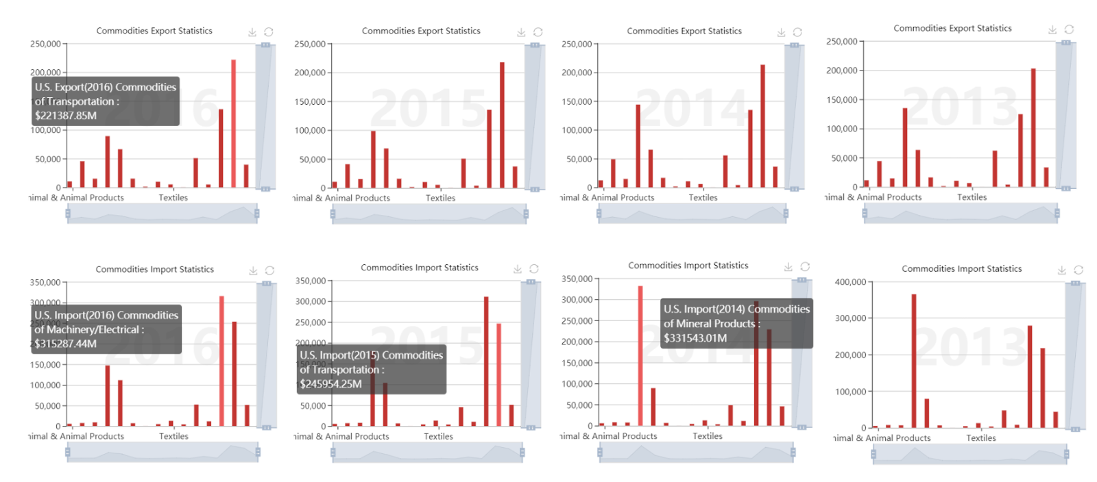
A. We can see that Transportation commodities are the most popular export commodity and reached $221387.85 million in 2013. Mineral Products were the most popular import commodity in 2013,2014 and reached $331543.01 million in 2014, but beyond Transportation and Machinery/Electrical commodities, which were the most popular in 2016 and reached $315287.44 million.
A. We can see that Transportation commodities are the most popular export commodity and reached $221387.85 million in 2013. Mineral Products were the most popular import commodity in 2013,2014 and reached $331543.01 million in 2014, but beyond Transportation and Machinery/Electrical commodities, which were the most popular in 2016 and reached $315287.44 million.
Q2-1. What are the states that have exported/imported the most popular commodities?
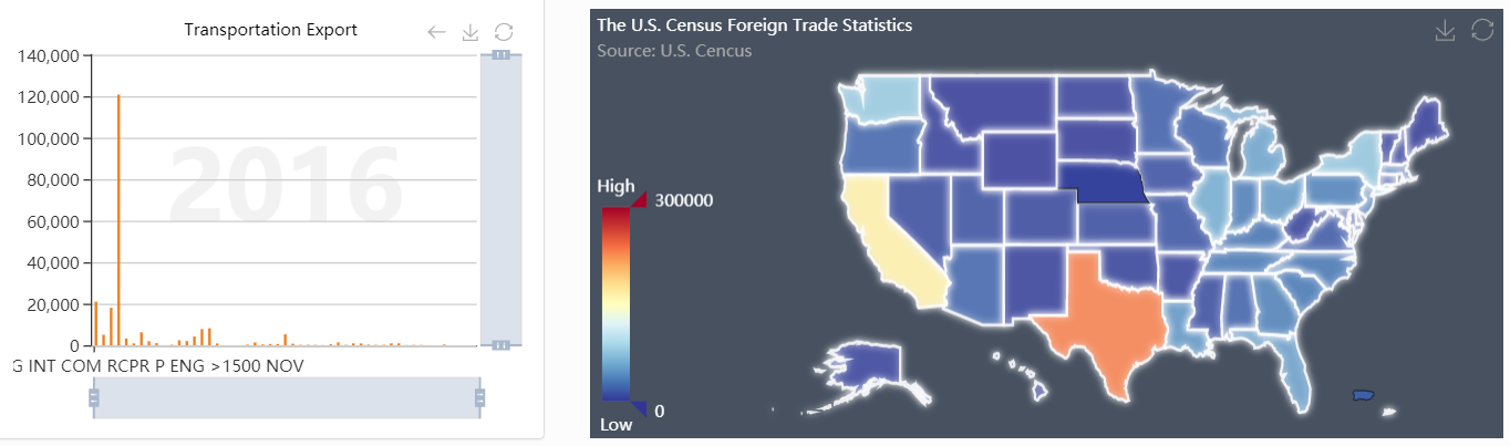
A. We know that Transportation commodities are exported by almost all States except Nebraska State and Puerto Rico in 2016, and the Machinery/Electrical commodities are imported by almost all States except New York State (need to hover to get the State’s name).
A. We know that Transportation commodities are exported by almost all States except Nebraska State and Puerto Rico in 2016, and the Machinery/Electrical commodities are imported by almost all States except New York State (need to hover to get the State’s name).

Q2-2. Which is the most popular commodity and country specifically in export/import commodities in 2016?
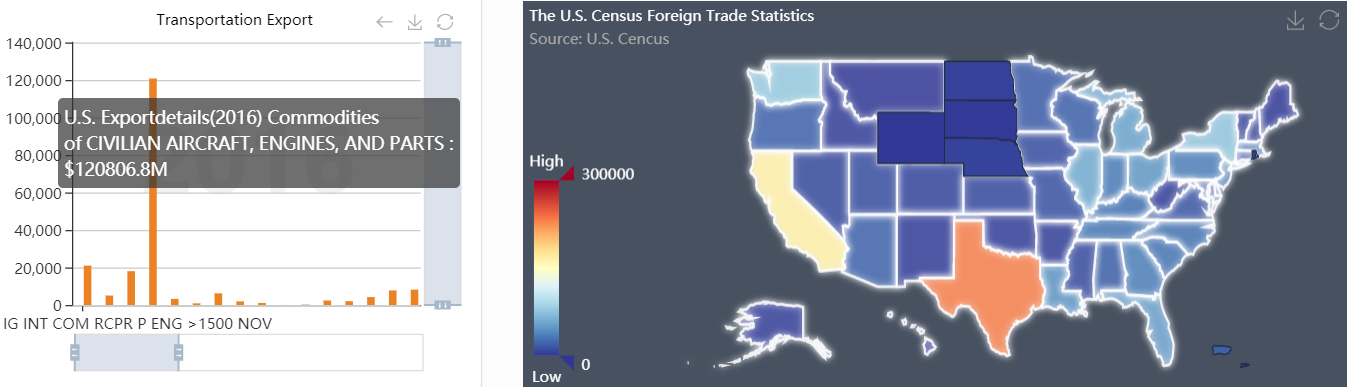
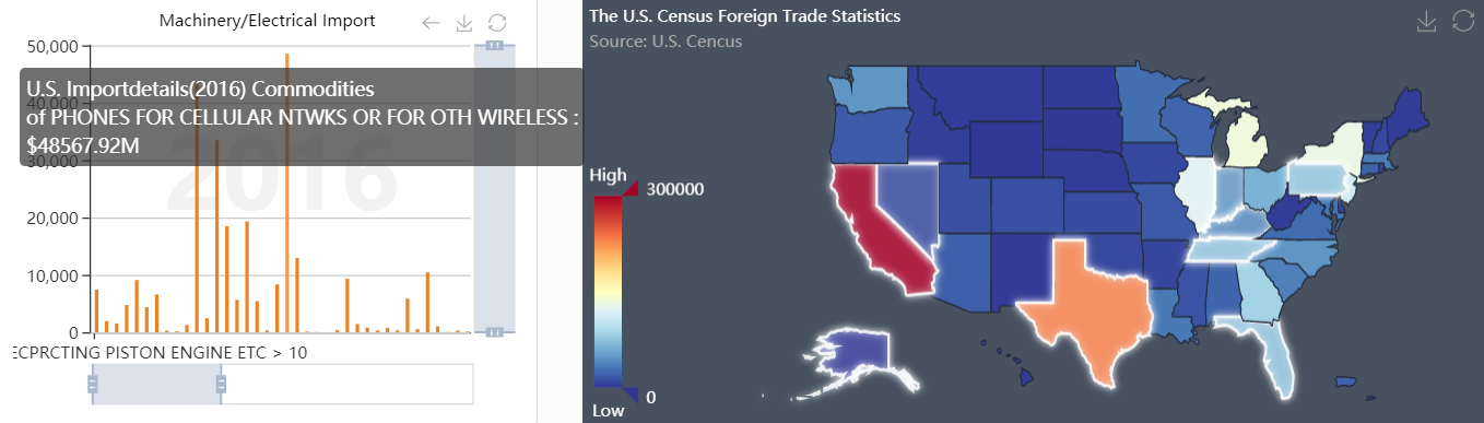
A. We can figure out that the ‘Civilian Aircraft, Engines and Parts is the most popular commodity in export, reaching $120806.8 million in 2016. Seems like the middle west of the U.S. doesn’t export this commodity. The ‘Phones For Cellular Networks Or For Other Wireless’ is the most popular commodity in import, reached $48567.92 million, and is the most imported from the east coast, middle south and east south of U.S. Besides, it is worth noting that there are several high import commodities under this category.
A. We can figure out that the ‘Civilian Aircraft, Engines and Parts is the most popular commodity in export, reaching $120806.8 million in 2016. Seems like the middle west of the U.S. doesn’t export this commodity. The ‘Phones For Cellular Networks Or For Other Wireless’ is the most popular commodity in import, reached $48567.92 million, and is the most imported from the east coast, middle south and east south of U.S. Besides, it is worth noting that there are several high import commodities under this category.
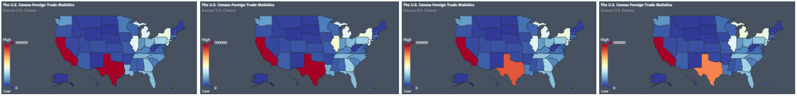
Q3. What is the export/import trend of states?
A. In these trend views, we can find that almost every state was stable in 2013-2016 except Texas, which decreased its export from $277715 million to $231106 million (about $46609 million) and decreased its import from $311712 million to $229294 million (about $82418 million).
A. In these trend views, we can find that almost every state was stable in 2013-2016 except Texas, which decreased its export from $277715 million to $231106 million (about $46609 million) and decreased its import from $311712 million to $229294 million (about $82418 million).

Export, 2013-2016
Import, 2013-2016
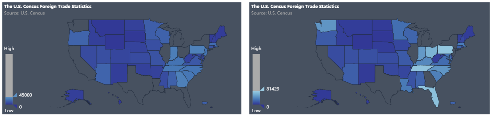
Q3-1. How severe the decrease of Texas state is?
A. We can drag the visual map in the U.S. map and see that $46609 million in export and $82418 million import even beyond most states' aggregate export/import in 2016. That’s dramatic.
A. We can drag the visual map in the U.S. map and see that $46609 million in export and $82418 million import even beyond most states' aggregate export/import in 2016. That’s dramatic.
Export, 2016 Import, 2016
Q4. Focus on Texas state, in 2016, which countries are its export/import partners? Which are the most important? How about its commodities?
A. We can figure out that Texas State exports to North/South America, Europe, Asia, and Oceania, and the most popular commodity is Petrol Oil, imports from North/South America, Europe, and Asia, and the most popular commodity is Crude Oil, which seems like an oil processing plant. Mexico is its biggest export/import partner.
A. We can figure out that Texas State exports to North/South America, Europe, Asia, and Oceania, and the most popular commodity is Petrol Oil, imports from North/South America, Europe, and Asia, and the most popular commodity is Crude Oil, which seems like an oil processing plant. Mexico is its biggest export/import partner.
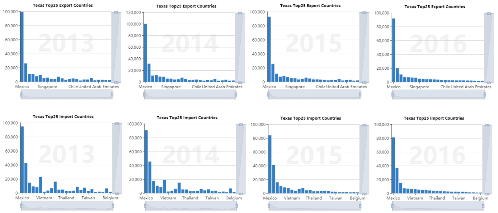
Q4-1. Can we figure out what is the main reason for Texas’s decrease in this multiple view system?
A. We can found that decreasing is obvious of import. For export, even though the decrease can be recognized, it is still not obvious.
A. We can found that decreasing is obvious of import. For export, even though the decrease can be recognized, it is still not obvious.
Q5. China’s export and Canada’s import are both significant, they show many times. How about their main partners in the U.S. recently?
A. We can figure out that China exports most commodities to the U.S. and California is its biggest partner, it’s obvious in map view. Besides, Canada imports most commodities from the U.S., and Michigan is its biggest partner, it’s not obvious in the map view, but we can recognize it from the bar chart.
A. We can figure out that China exports most commodities to the U.S. and California is its biggest partner, it’s obvious in map view. Besides, Canada imports most commodities from the U.S., and Michigan is its biggest partner, it’s not obvious in the map view, but we can recognize it from the bar chart.